 |
| Egg Yolk (MSL 8176) |
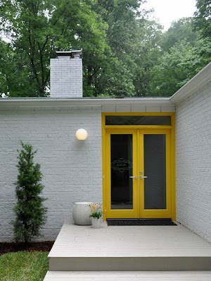
Anyway, back to yellow. Yes, yellow. I really really want to not like it. But I am a sucker for colors that are true reflections of their name. Can't you just picture a sunburst egg yolk sizzling on a frying pan?- it's beautiful. Sometimes, I daydream about a yellow kitchen, or maybe a contrasting bright yellow and white throw pillow. Caution- use a color like this in highly contained doses. A little bit goes a loooong way. But still keep in mind Steve's rule of 3: An accent color must be incorporated into a room at least 3 times for it to flow.
 |
| MSL's Egg Yolk used sparingly on french doors for entryway impact! |
Hi - I found you on a google search of MS paint reviews. I guffawed. And yes, I'm noticing her colors are muddier and less alluring (Duck Egg and Beet, I'm looking at you) on the wall than the swatch - caused by the translucence of the white paper behind the dye process, I think, because the paint pigments themselves are more opaque by necessity. Oh, how her subtle robin's egg blues and greens draw me on paper! Alas, none seem to work in reality. But I bought a quart of Egg Yolk for some strange reason - it just really drew my eye. It's a color not reproduced in any other line I've seen - there's an olive-green undertone to it (like yolks that have been boiled - you know how they get that green edge?). The greyed-out saturation makes me think of pure 1930s chartreuse. Very Jazz Age. I'm painting an accent wall in my kitchen, the one that leads to a Roycroft green dining room. On that one wall it looks great. On the other walls it looked like bad kindergarten paint.
ReplyDelete